Responsive Web Design with Adobe Dreamweaver
Updated on
Course overview
- Provider
- Domestika
- Course type
- Paid course
- Level
- Beginner
- Deadline
- Flexible
- Duration
- 5 hours
- Lessons
- 31 lessons
- Certificate
- Available on completion
- Course author
- Arturo Servín
-
When designing a website, you have to think that it will be seen on a computer, but also on a smartphone or iPad. Phone use is gaining more and more weight and this places designers in a new scenario, in which they must design for various formats, thinking about the multi-screen user’s comfort.
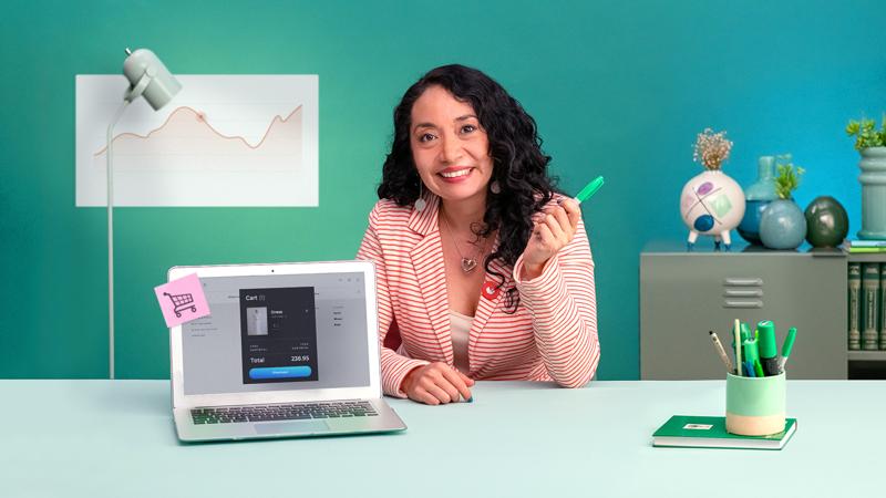
In this course, web designer Arturo Servín—also known as Monky Lab—will teach you how to make a responsive website with Adobe Dreamweaver in a visual way, using a graphical interface with construction and writing tools, with HTML and CSS code. By fusing basic programming and design, you will gain greater control in the elaboration of any web file.
This is already the fourth course by Arturo Servín and, to make the most of this one, you can complement it with his Adobe Photoshop for Web Design course, in which you will learn the key aspects of responsive design and layout in a simple way.
Description
Arturo Servín starts the course explaining how he got started in web design and how he has been facing various technological changes and advances. He will talk about his influences and show you functional web design references.
Get to know the basic principles of web design, to then learn how to differentiate UX from UI. Arturo will also give you some advice on art direction and the construction of the site and its standards.
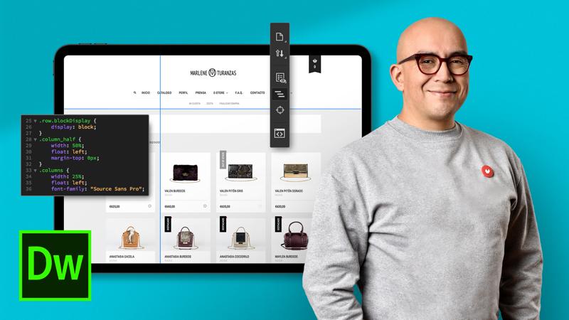
Learn how to use the tools Adobe Dreamweaver offers to build a website, in which you will be placing the base tags with HTML language and establishing parameters. You will experiment with placing text and images, as well as links to different kinds of files.
Complement the visual structure using CSS windows. You will learn to generate selectors and values, then to establish the box model oriented to responsive parameters and through CSS elements you will style your page: fonts, box design, position application, display, and floats; and you will apply background images, borders or lists, and classes, among other elements.
How to make your site responsive? Establish the construction parameters of the site using Media Queries for the different measures required, create a simple menu that works for both smartphones and computers, and see how to review and correct it before uploading your website.
Everything is now ready to publish! Using the FTP window of the program, you will synchronize the local folders of the site with the folders of the remote site. This way you’re able to make changes immediately on your website.
Similar courses

-
Flexible deadline
-
4 hours
-
21 lessonsCertificate

-
Flexible deadline
-
2 hours
-
14 lessonsCertificate