Course overview
- Provider
- Domestika
- Course type
- Paid course
- Level
- Beginner
- Deadline
- Flexible
- Duration
- 2 hours
- Lessons
- 23 lessons
- Certificate
- Available on completion
- Course author
- Gemma Busquets
-
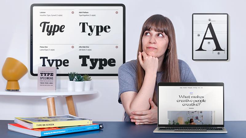
From user reading habits to devices, browsers and operating systems ... To choose a typography for digital content, many factors must be taken into account that determine that the texts are legible and look good on screens. Gemma Busquets - graphic designer, art director and teacher - is a specialist in the area, with more than 10 years of experience collaborating for clients such as Dell, San Miguel, Huffington Post, Coca-Cola, Nike, Peugeot or Puig and sharing their knowledge teaching in the Master of Infographics and Data Visualization of the BAU (Barcelona).
In this course Gemma will teach you the necessary knowledge to work typography to visualize them perfectly on screens. At the end of the course you will be able to improve the text of your website, blog, portfolio, digital magazine or ebook to better transmit the message, be readable and have a clear structure.
Description
First you will meet Gemma, who will tell you a little about her passion for design, her professional career as a designer and teacher, in addition to the most representative projects she has done for large brands. In addition, it will share its influences, which vary between books and websites that will serve as inspiration.
You will learn a little history and the importance of typography in digital formats. You will understand what differences there are between designing with paper and digital typography, considering devices, screens and formats. You will see what micro and macrography is and you will know the concepts of hinting , anti-aliasing and spelling.
How to choose a typography? Where to find an ideal for screens? Gemma will explain everything you need to get the perfect typography for your project, it will show you the websites where you can download it and the features it must have to invite you to read on screen.
You will choose different fonts for different functions of the text: headlines, body of text and interactive elements, and then enter the composition. You will see everything about the recommended font size for digital reading and how you should adjust it according to the device on which the font will be rendered.
You will create a grid to sort the content on the page, define an appropriate column width and learn about ways to establish hierarchy between the elements of the page considering a key element: the blank space.
You will make a final check to test what the typography looks like in different browsers and operating systems, using some tools and tricks that Gemma will share with you.
At the end of the course you will have the necessary knowledge to choose the typography for a digital project and, in addition, you will know how to work so that your texts are comfortable to read.
Similar courses

-
Flexible deadline
-
3 hours
-
16 lessonsCertificate

-
Flexible deadline
-
2 hours
-
12 lessonsCertificate

-
Flexible deadline
-
5 hours
-
22 lessonsCertificate

